
I turned a WhatsApp-and-phone chauffeur service into a self-serve platform
- Transportation Tech
- Product Designer
- Research to launch, then improvements
- Live on web and mobile
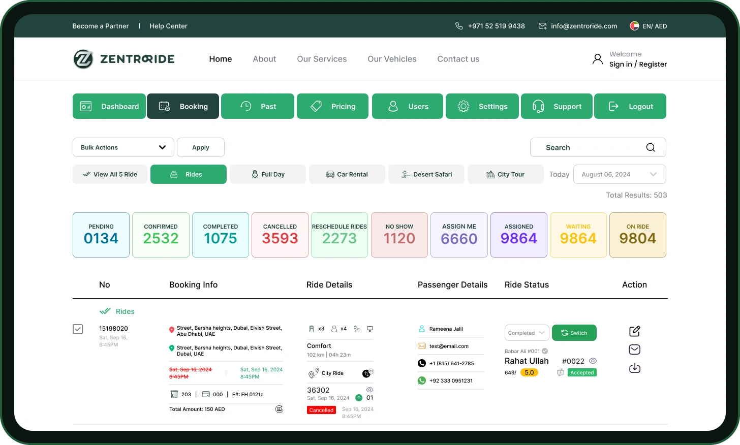
A rider books. Operations sees it in the live queue.
RESULTS
What changed after launch
As of July 2025
THE NEW FLOW
From choosing a ride to my bookings
Scroll, and the booking builds itself: one screen appears, a line draws to the next.
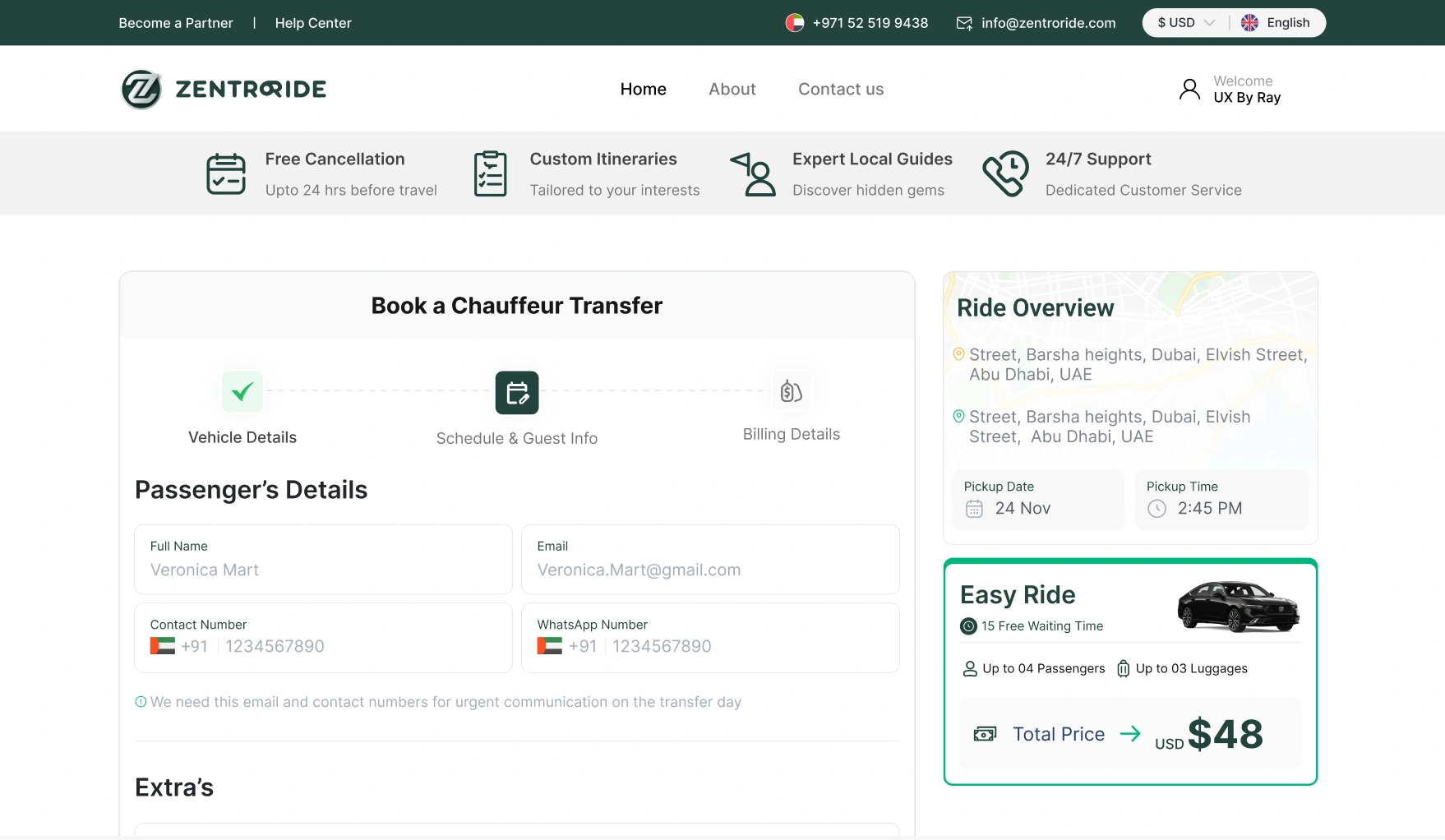
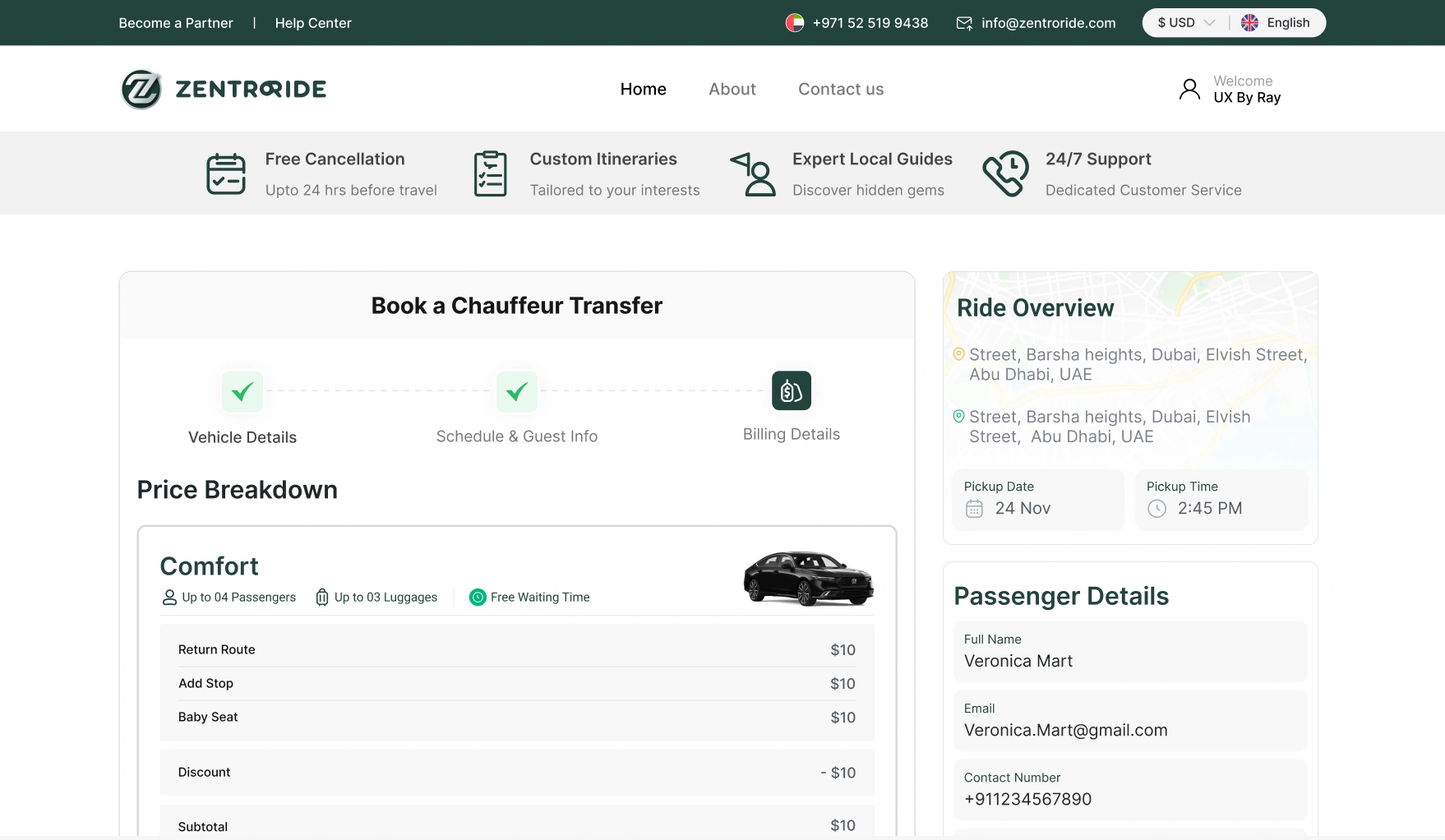
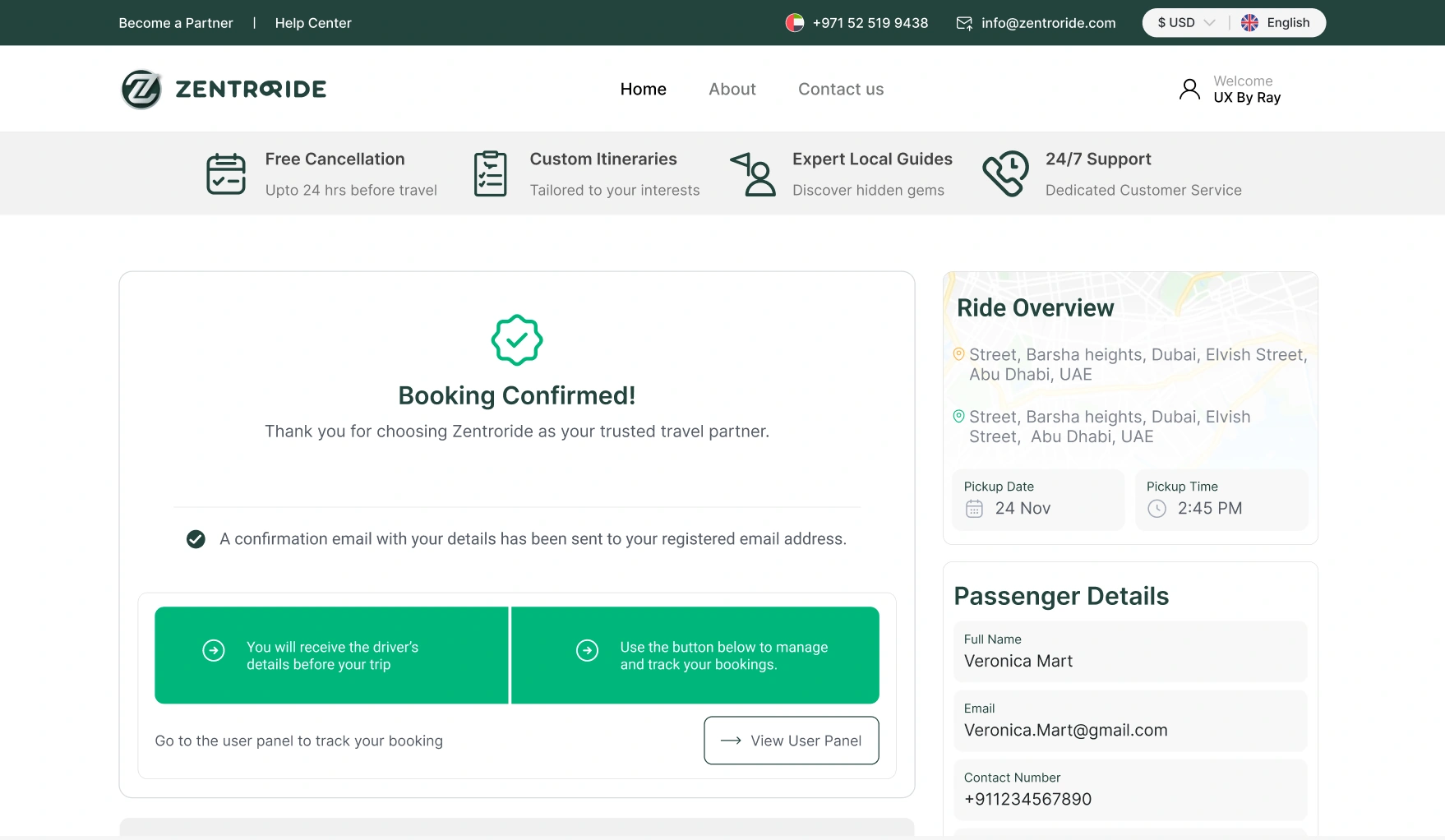
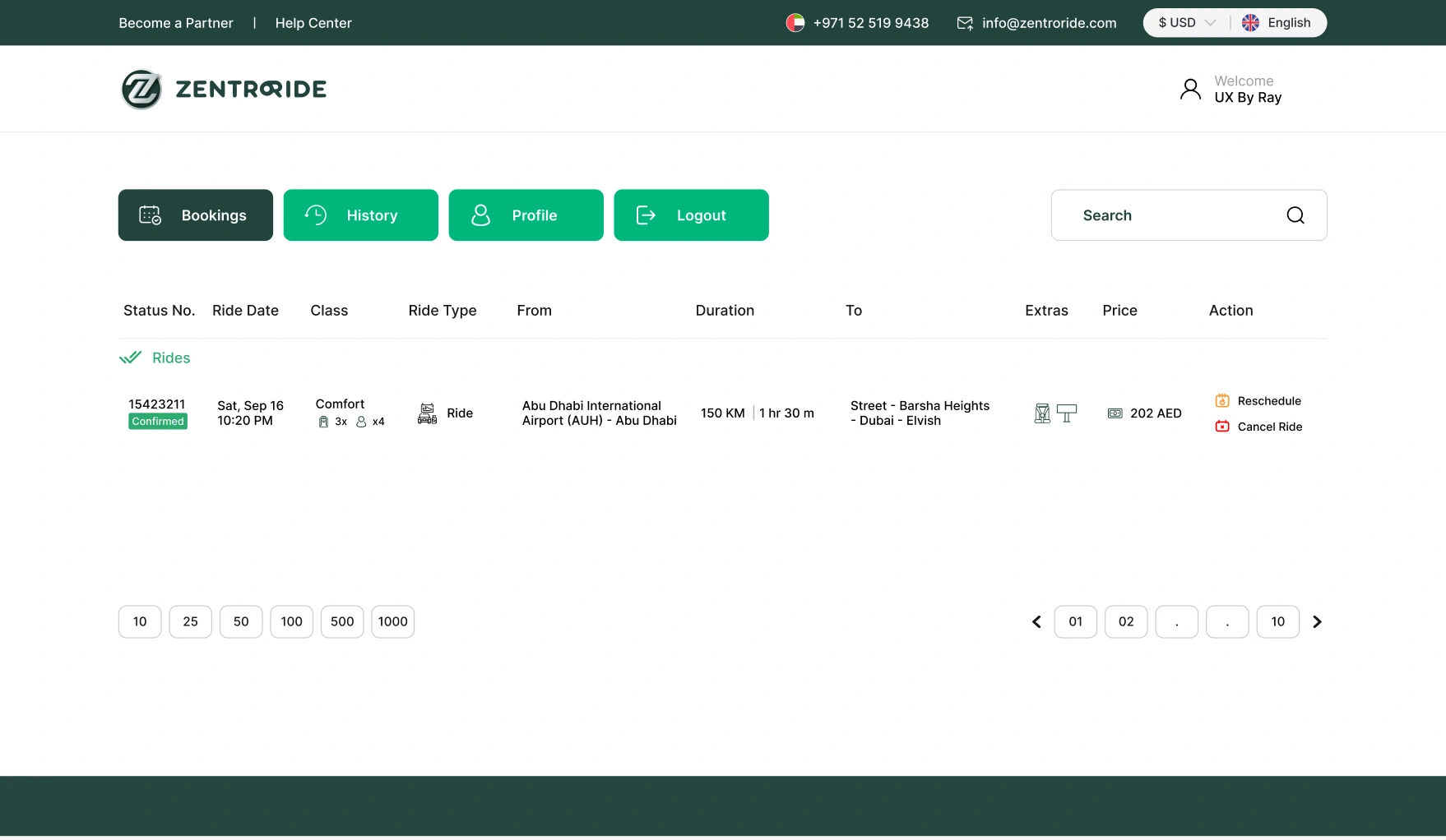 Price shown first
- 1Choose the ride
- 2Select a car
- 3Add details
- 4Price breakdown
- 5Booking confirm
- 6My bookings
THE OLD FLOW
Everything happened in chat and on calls
Demand had outgrown two people. Agents took requests by chat and phone.
Compare with the new flow: one booking, one price, one record.
RESEARCH
Five problems kept coming up
14 interviews, 4 stakeholder interviews, 9 usability sessions and a survey of 78.
Riders didn't know the price until too late.
24 of 78Riders didn't know the price until too late.
survey respondents named unclear prices or hidden fees as their biggest frustration.
Each dot is one survey respondent"SUV" didn't say how many people or bags fit.
82%"SUV" didn't say how many people or bags fit.
said knowing the exact capacity matters to them. In testing, 5 of 9 people struggled to pick a car that fit.
Airport pickups caused worry.
34%Airport pickups caused worry.
wanted a direct line to the driver. Another 29% wanted live flight tracking.
Booking for someone else was awkward.
3 of 9Booking for someone else was awkward.
testers couldn't set a different passenger or receipt recipient.
Operations had gaps.
Flat listOperations had gaps.
The operations manager started each day scrolling a flat list of bookings, looking for anything unusual. Cancellations and reassignments had no reason attached.
IN THEIR WORDS
What testers said, out loud
I just picked the biggest car because I wasn't sure our bags would fit.
I'm the one booking but I'm not the one riding, the form assumes I'm both.
THE SURVEY
What 78 riders told us
The questionnaire plays by itself, one screen every 2 seconds.
PLAYLIST
QUESTION 1 OF 4 PLAYING
I would pay a premium for a guaranteed fixed price with no surprise fees.
Knowing the exact capacity of a vehicle matters to me.
For an airport pickup, what would help you most?
What is your biggest frustration when booking a ride?
Next screen in 2s
WHAT RIDERS ANSWERED
Q5 · Fixed price
74%
would pay a premium for a guaranteed fixed price
Of 78 survey responses
The number and the bar change with each screen: 82%, then 34%, then 24 of 78.
Source: ZentroRide survey, 78 responses.
AFTER LAUNCH
The booking form won
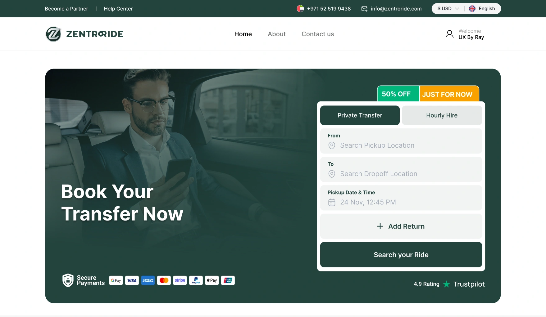
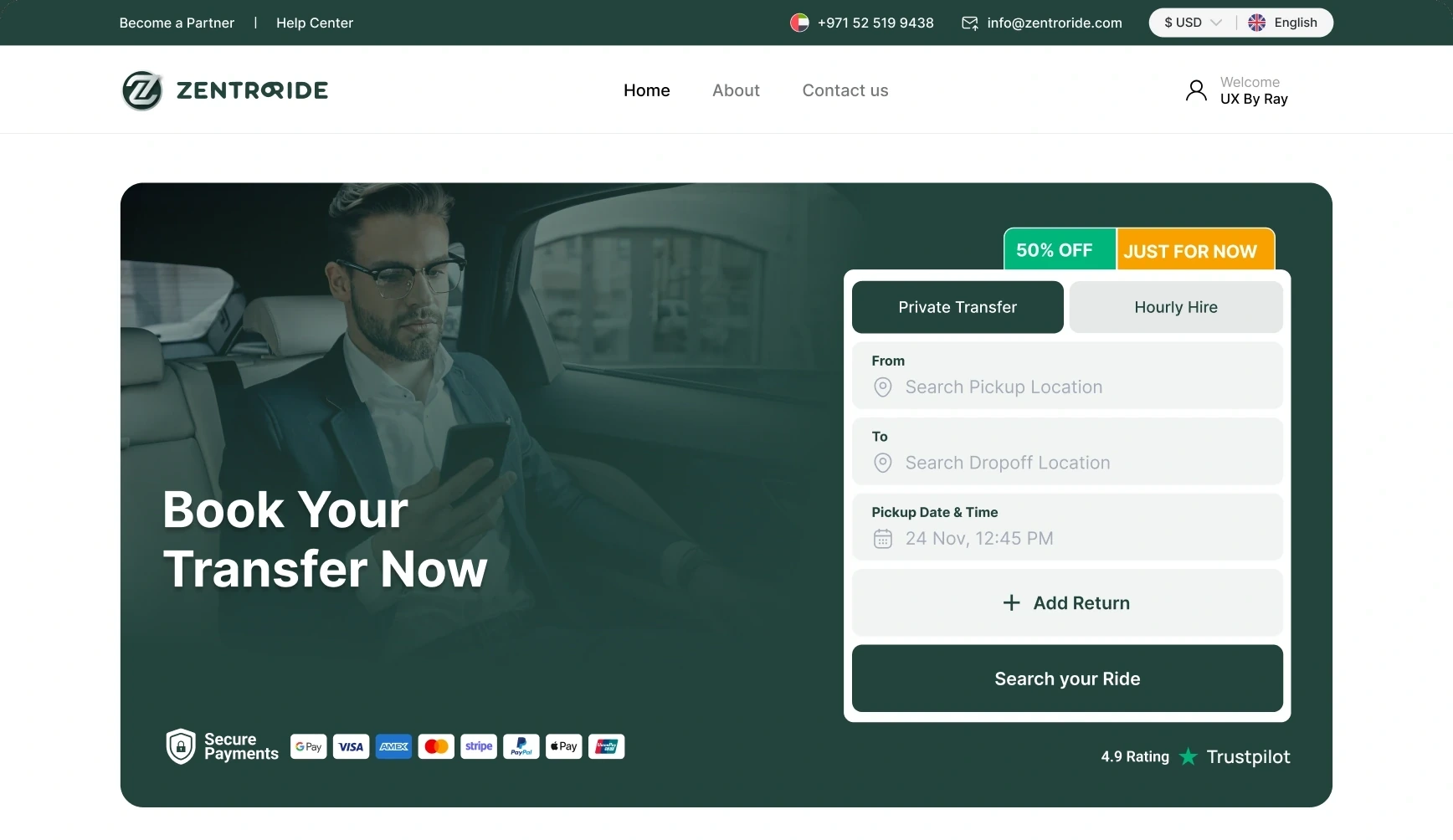
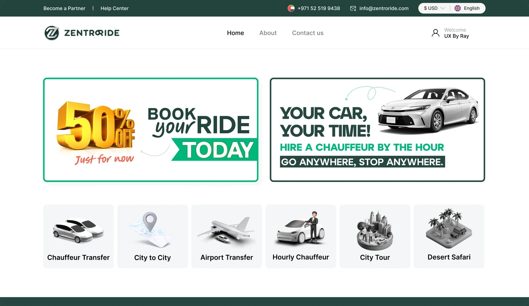
We tested two homepages. Version A led with promotional banners. Version B led with the booking form. Riders came to book, so the form went first. The banners moved lower, into a "Worldwide Chauffeur Offers" section.
Promotional banners first, booking tools below.
Booking form first, offers lower down.
FOUR DECISIONS
Each one backed by research
DECISION 01
Show the price first
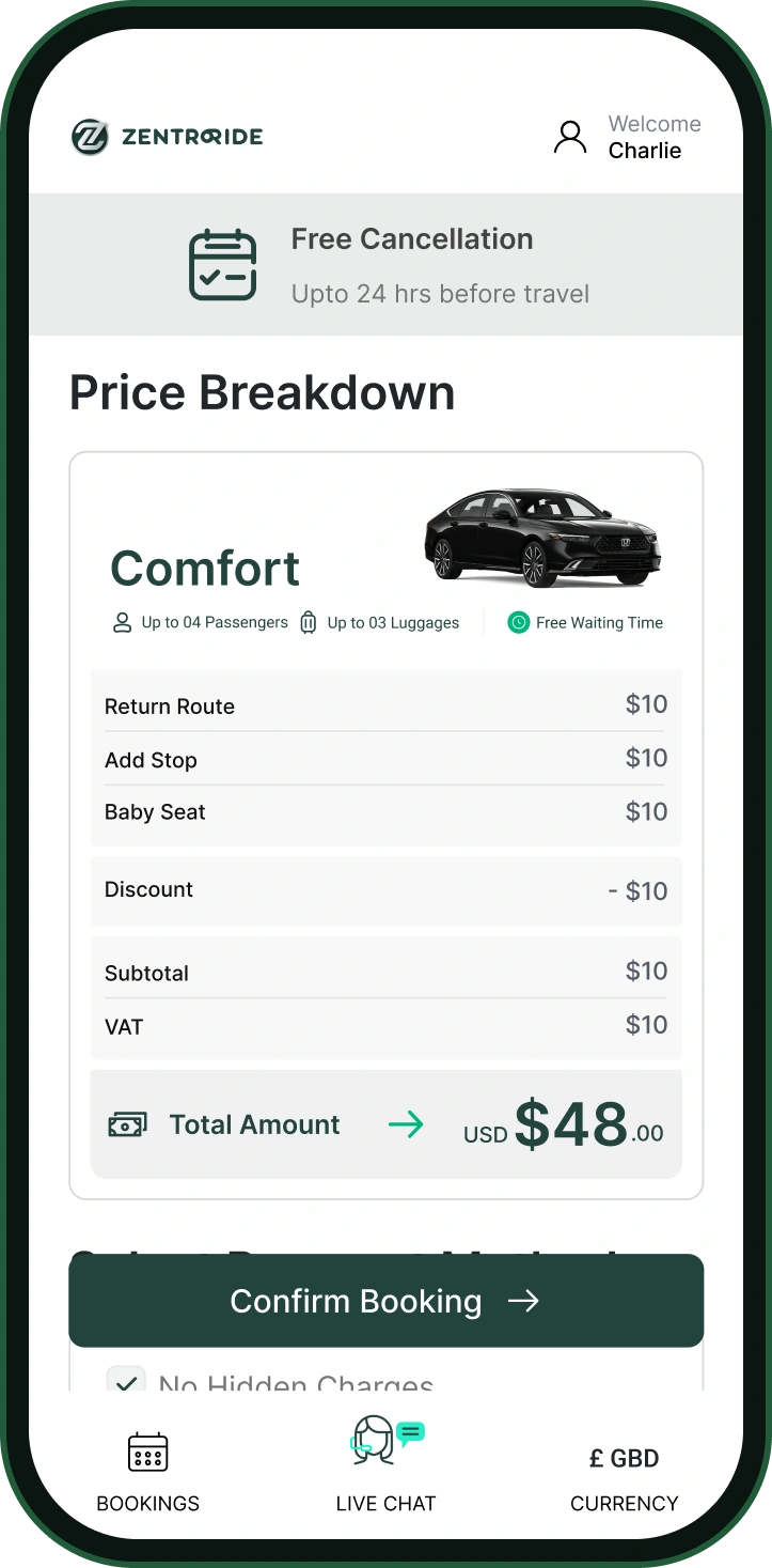
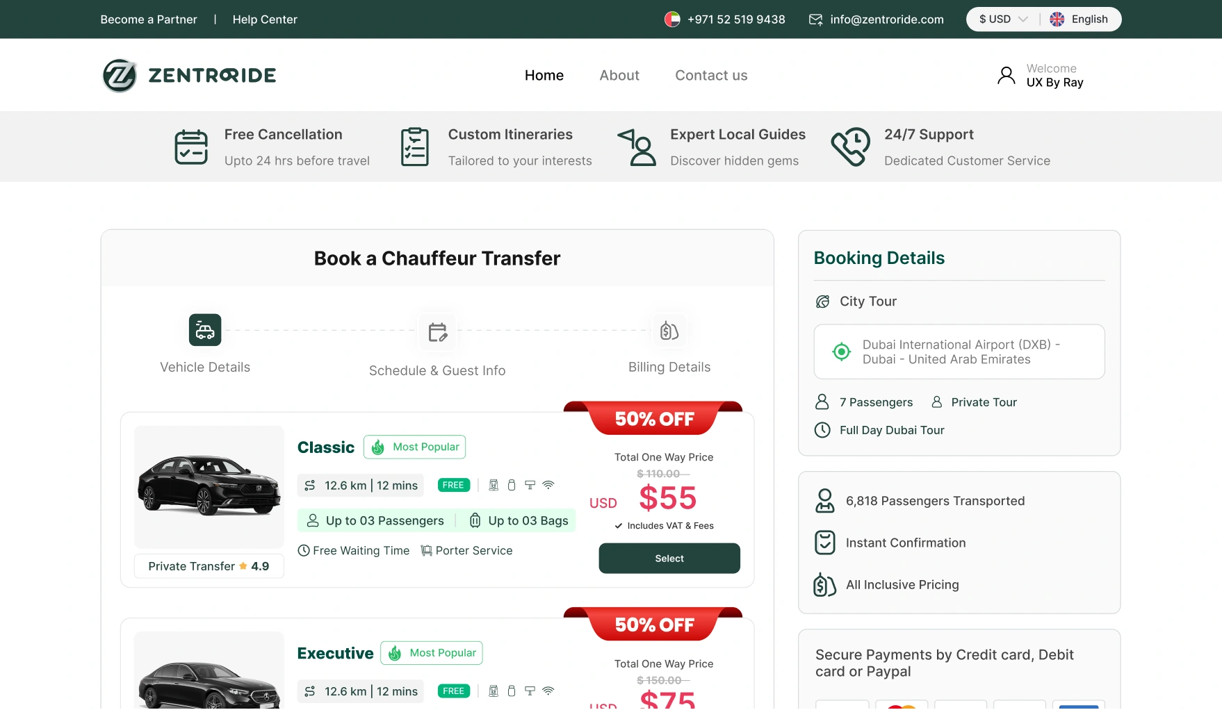
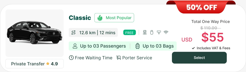
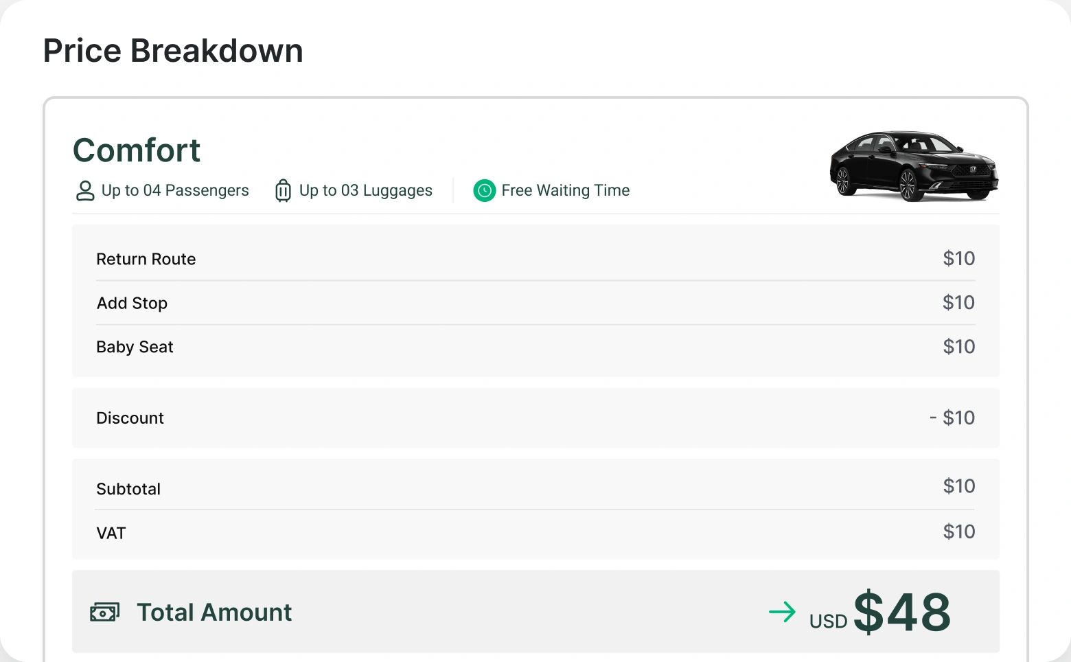
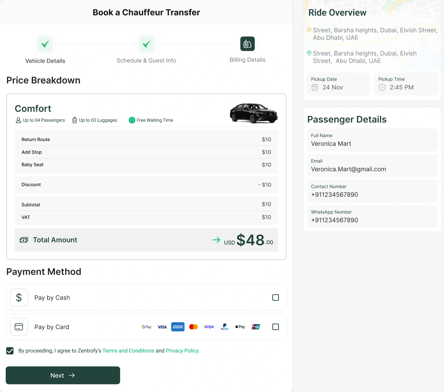
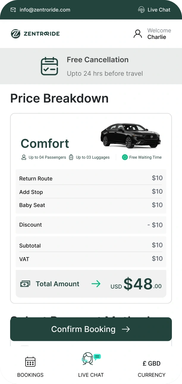
Surprise prices were the main reason riders didn't trust online booking. So the fare, what's included, waiting time and cancellation rules now appear before payment.
74% said they would pay a premium for a guaranteed fixed price. 4 of 9 testers couldn't find the cancellation policy before paying.
I considered showing the price only at checkout, like most ride apps. Riders told me that was the problem.
PRICE ON THE CAR CARD
"I paid first and only then wondered what happens if our flight is delayed."
THE FULL BREAKDOWN, BEFORE PAYMENT
DECISION 02
Say exactly what fits
"SUV" and "premium" didn't help families. Each vehicle now shows its seats and luggage.
82% said exact capacity matters. 5 of 9 testers struggled to pick a car that fit.
I considered keeping class names with a short description. In testing, people still guessed.
THE CAR CARD NOW

BEFORE: CLASS NAME ONLY
NOW: SEATS AND BAGS
DECISION 03
Booker and passenger are different people
Executive assistants often book for someone else. The old flow treated them as one person, so key details ended up in notes. Now the booker, the passenger and the receipt each get their own place.
3 of 9 testers couldn't send the receipt to someone else. 11 of 78 survey respondents named it as their biggest frustration.
I considered a "booking for someone else?" checkbox. Drivers still got the wrong contact.
PASSENGER DETAILS: BOOKER AND PASSENGER ARE SEPARATE
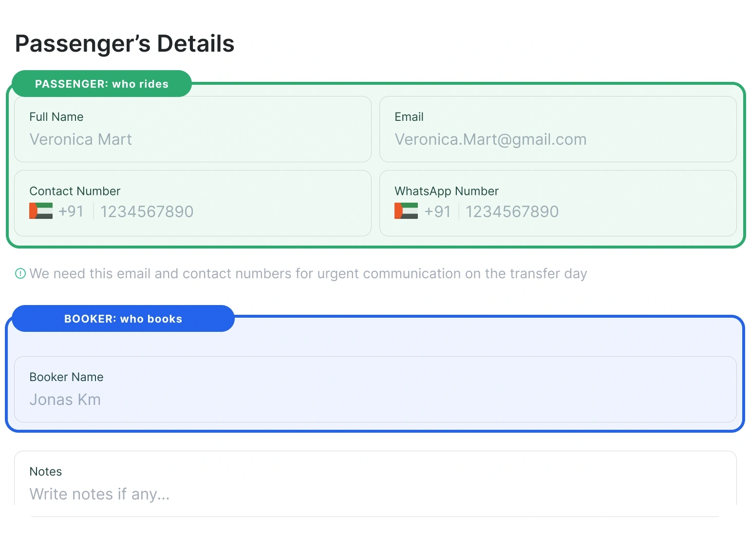
Booker · Passenger · Receipt: each gets its own place and its own contact.
DECISION 04
Urgent work first, records second
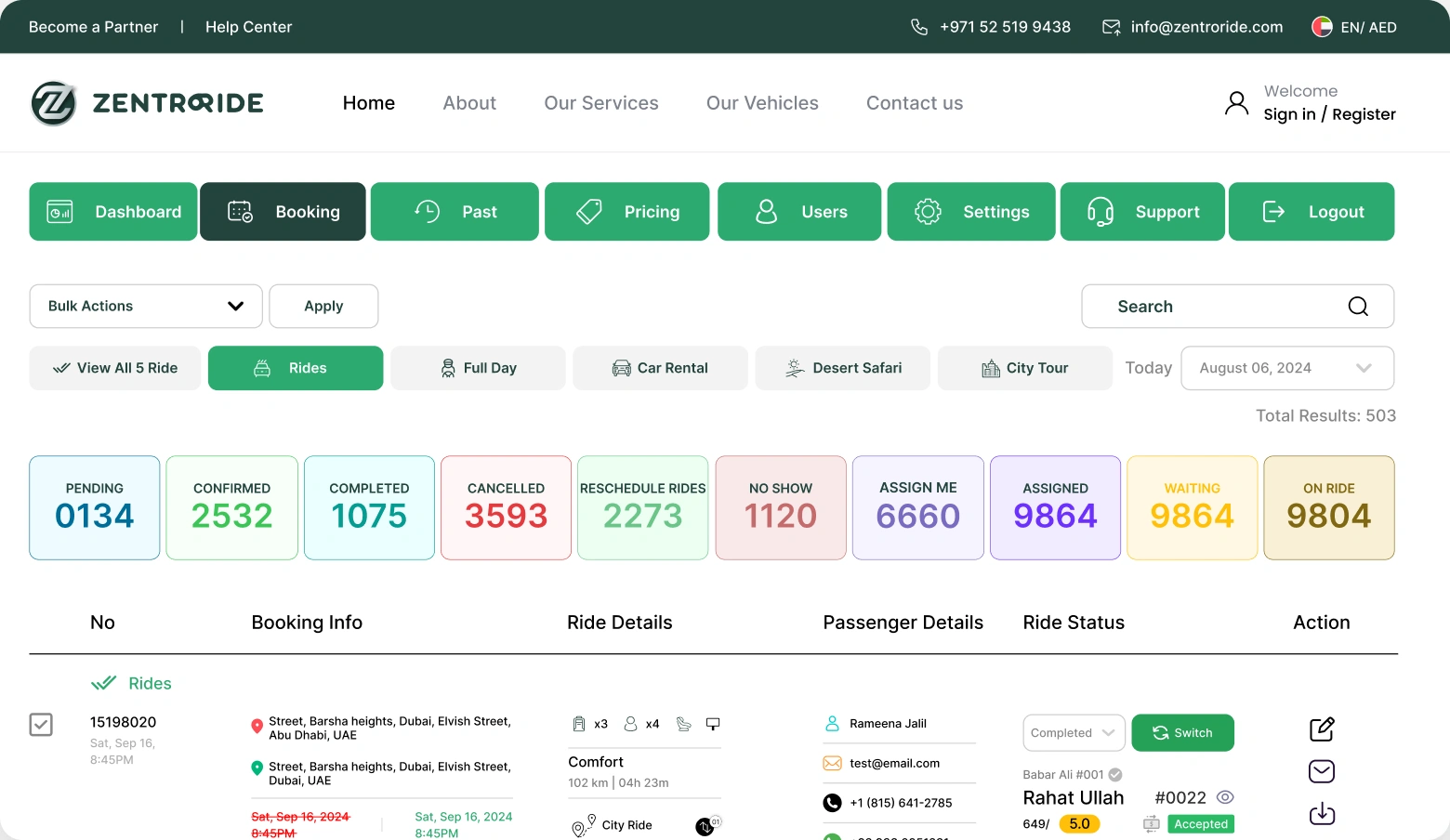
Admins had two jobs: live rides and record keeping. Live issues now sit in their own queue. Users, approvals, reports and settings live elsewhere.
The operations manager had no exceptions view and checked a flat bookings list every morning. The founder named an exceptions-first dashboard as the one thing to fix.
I considered one combined dashboard. Urgent issues got buried.
LIVE QUEUE: URGENT RIDES FIRST
RECORDS: USERS, APPROVALS, REPORTS, SETTINGS
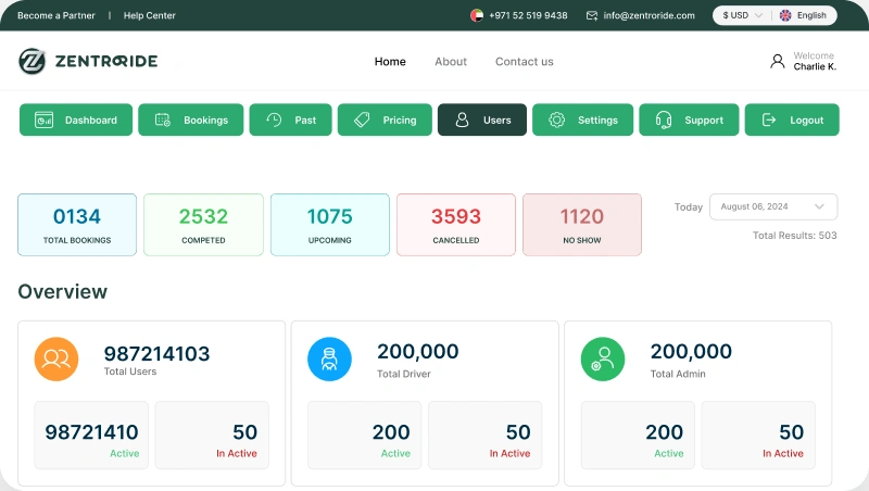
Everything that is not urgent lives here, so the queue stays short.
AFTER LAUNCH · TWO MORE CHANGES
Two more changes
CHANGE 01
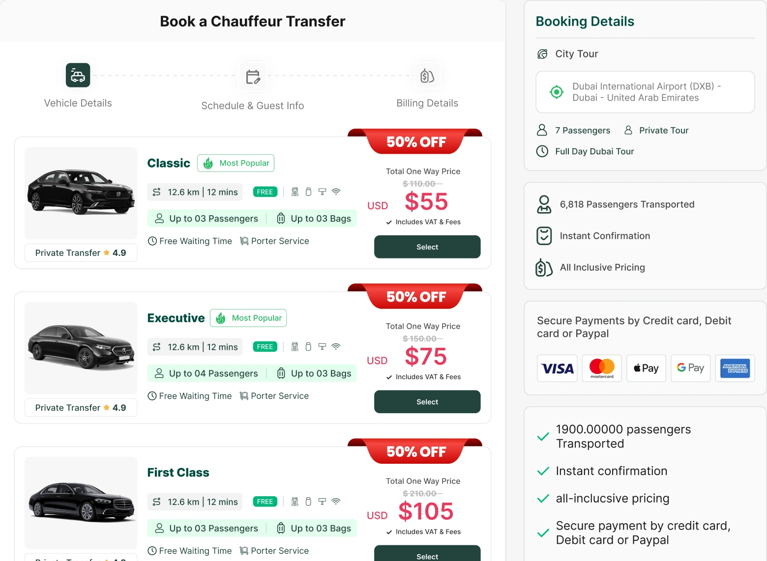
Vehicle cards that answer "what do I get?"
Each car shows what's included, with a trip summary next to it. Riders compare value, not just price.
SELECT A CAR: WHAT'S INCLUDED, WITH A TRIP SUMMARY NEXT TO IT
CHANGE 02
Paid extras with the price shown up front
Meet and greet, a stop on the way, a child seat. The total updates as you add them.
ADD DETAILS: EXTRAS WITH THEIR PRICES, AND THE TOTAL
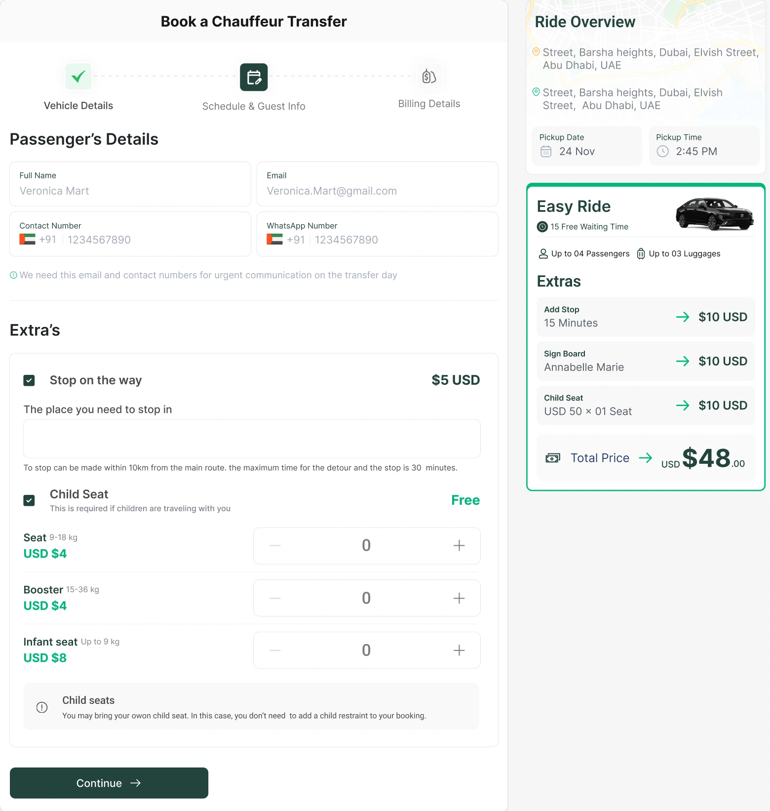
PRICE BREAKDOWN: EXTRAS AND THE UPDATED TOTAL
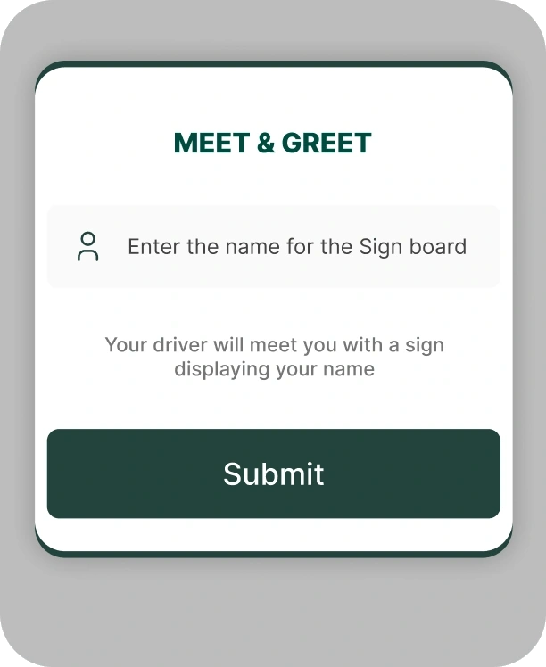
ON MOBILE
The same changes, on a phone
Riders add a name for the sign board, then see the price breakdown.
ONE DASHBOARD PER ROLE
Each person asks one question
One design system keeps them feeling like one product.
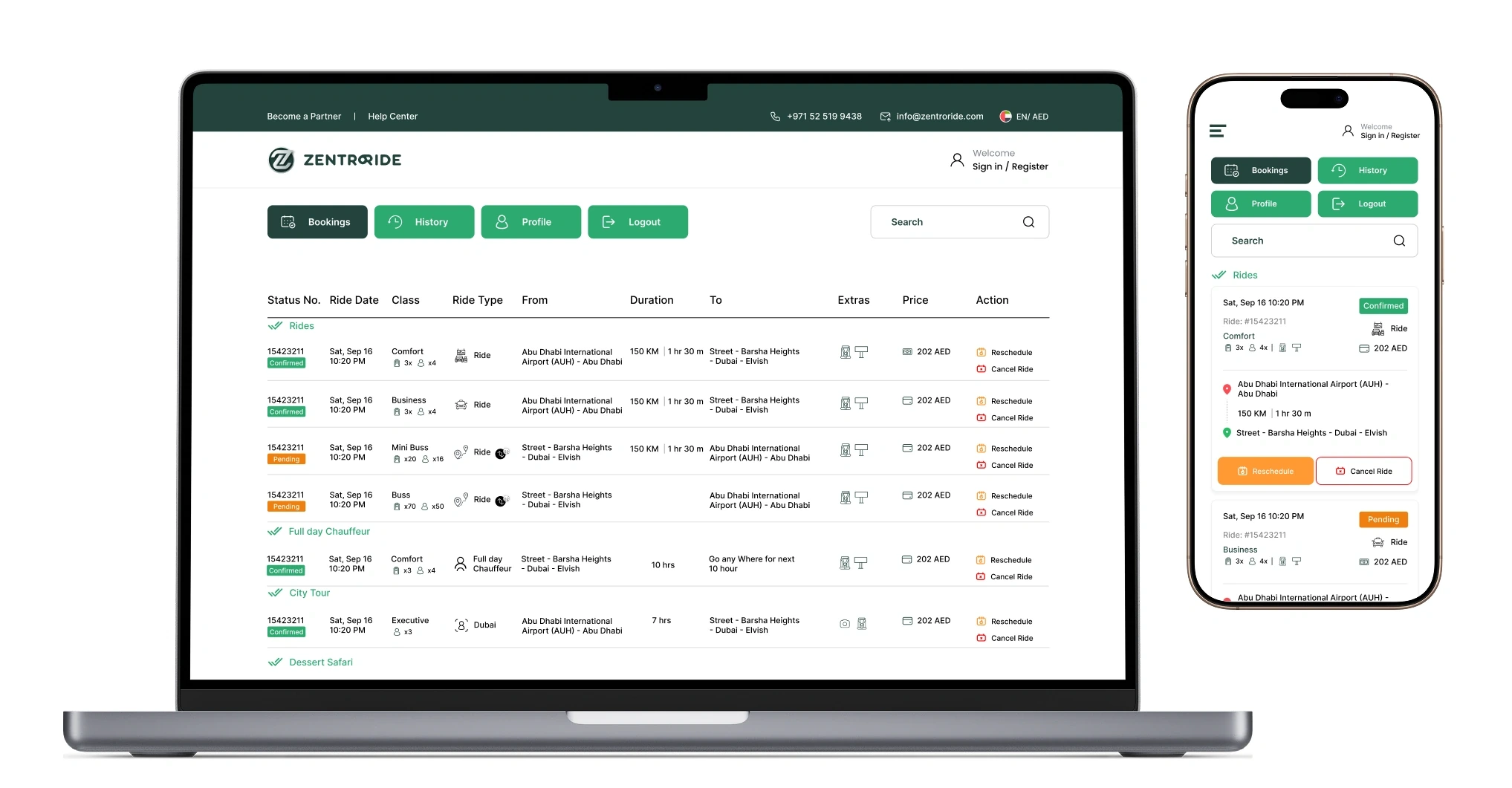
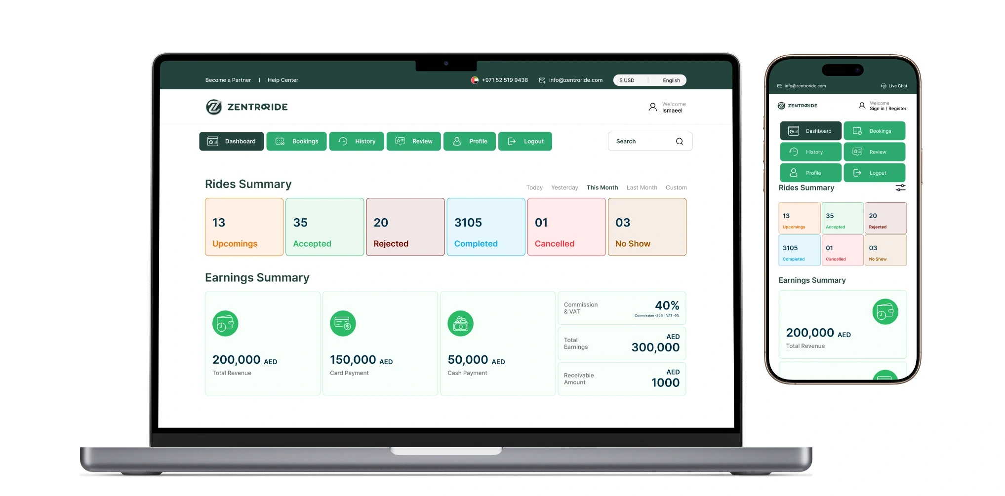
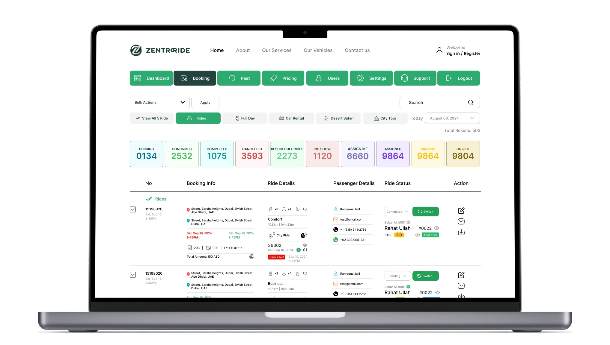
RIDER DASHBOARD
WHAT I LEFT FOR LATER
Admin workflows came first
Admin workflows came first, because a failure there stops the whole operation.
RESULTS
As of July 2025
Booking completion as reported by the project manager from the platform's analytics.
BEHIND THE WORK
Who did what, and when
- ROLE
- Product Designer (sole designer, freelance)
- CLIENT
- ZentroRide
- DATES
- Sep 2024 – Sep 2025
- TEAM
- Founder, product manager, operations manager, 2 backend developers, 1 frontend developer
The file was clean and easy to work with, handoff was easy, and the design system was easy to implement.
WHAT I WANTED TO SHOW YOU
Good product design is often about settling a disagreement with evidence instead of opinion.
WHAT I LEARNED
When the founder and I disagreed about the homepage, a test ended the argument faster than a debate could have. I now bring a test with me when I disagree.